
HCI
HW1 · Everyday interaction
Draft · awaiting personal reviewHW1 / Lectures 1–3 / 15 points
One good and one bad affordance, two Gestalt failures, and two dark patterns—with images, explanations and redesign proposals.
Evidence status. This is an illustrated analysis draft using credited reference images. It does not claim personal observation or completed user testing. HW1 asks for daily-life examples in Parts 1 and 2; add or replace these references with observations from actual use before submission.
In this assignment
- 01 · Affordances — 5 points
- 02 · Gestalt laws — 5 points
- 03 · Dark patterns — 5 points
- 04 · Lab Homework 1 — separate tasks
Part 01 / Lecture 1
Affordances: what can I do?
Task: Document one good and one bad affordance with a picture or video. Explain both and propose a fix for the bad example.
An affordance is an action an object allows, such as pressing or grasping. A signifier helps a person discover that action. A misleading handle can allow grasping while suggesting the wrong way to open a door.
Case 1 / 6
Good example: iPhone volume buttons
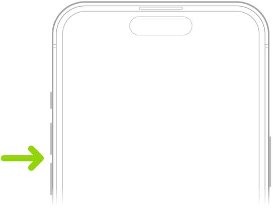
Goal. Adjust the sound while listening to music or watching a video.
Analysis. The raised side buttons provide a surface that can be pressed and located by touch. Their physical shape signals an available action. During playback, pressing them changes the sound level, allowing the user to check the effect immediately.
Pressability is the physical affordance; the protruding shape is a signifier. The relationship between the two buttons and increasing or decreasing volume is mapping, while the audible change is feedback. These concepts work together, but are not interchangeable.
The shape alone does not explain every context-dependent function. This positive example concerns media-volume adjustment, not every iPhone interaction.
Personal evidence to add: a photograph of the phone actually used, the app and task, and what happened when each button was pressed.
Case 2 / 6
Bad example: a pullable handle on a push door
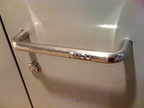
Goal. Open the door.
Analysis. The handle can be grasped and pulled, yet the word PUSH specifies the required direction. The photographer reports that the design confused her and describes another visitor trying to pull a similarly equipped door. That is the source author’s observation, not my own.
The handle’s physical affordance and visual suggestion compete with the intended action. A user may pull first, receive no opening movement, and incorrectly conclude that the door is locked.
Redesign. Replace the handle on the push side with a flat push plate.
Proposed redesign · schematic
PUSH
Use a flat push plate on this side.
Retain a pull handle on the side that requires pulling.
A plate offers a place to press without an inviting gap to grip. The physical cue and the door’s motion agree. This proposal has not been tested.
Personal evidence to add: a real door you encounter, its required opening direction, and a photo or short video of the interaction.
Part 02 / Lecture 2
Gestalt laws: what belongs together?
Task: Document two daily-life applications of Gestalt laws that went wrong, including digital examples, and suggest corrections.
The course introduces six principles: proximity, similarity, common region, continuity, closure and figure–ground. This task asks for two failures, not six separate definitions.
Case 3 / 6
Common region: an escalator warning splits the message
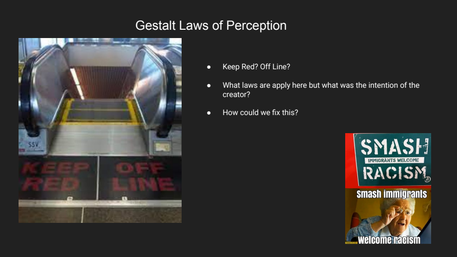
Goal. Read the safety message before stepping onto the escalator.
Analysis. The intended sentence is KEEP OFF RED LINE. However, the border divides the words into two regions: KEEP / RED and OFF / LINE. Reading within each panel produces the wrong word groups.
Common region makes words inside the same boundary appear related. Here the visual grouping conflicts with the sentence’s intended reading order.
Redesign. Put the complete instruction inside one clearly defined region.
Proposed redesign · schematic
KEEP OFF
THE RED LINE
THE RED LINE
One message, one region. Keep the entire instruction together rather than splitting it across side-by-side mats.
The layout supports reading the instruction in order. Placement and legibility would still need checking from the approach direction.
This is a classroom reference. Replace or supplement it with a comparable sign you actually encounter; record where it is and how the grouping affects reading.
Case 4 / 6
Proximity: “Skip” is separated from the sign-in choices
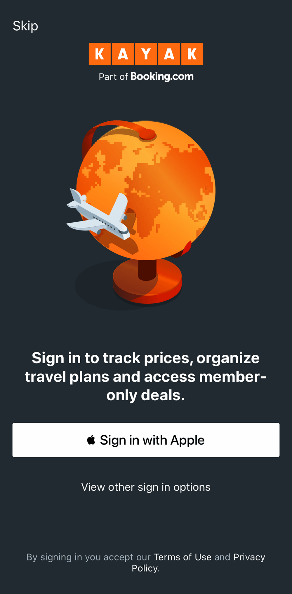
Goal. Continue into a travel app without creating an account.
Analysis. Sign-in choices sit together near the bottom, while Skip sits alone at the top. A person concentrating on the lower controls may miss the alternative.
Proximity suggests relatedness. Separating Skip from the other ways to continue makes the available choices harder to compare.
Redesign. Group all ways to continue together, including an explicitly labelled guest option.
Proposed redesign · schematic, not a live login
How would you like to continue?
Putting the alternatives together and replacing Skip with an explicit label makes guest access easier to notice. This is a layout critique, not evidence that the separation was intentional.
Personal evidence to add: an app you actually use with separated related controls, its version or capture date, and an annotated screenshot.
Part 03 / Lecture 3
Dark patterns: whose goal comes first?
Task: Document two dark design patterns and discuss how to redesign them to achieve the opposite effect: clear information and meaningful user choice.
Case 5 / 6
Disguised advertising: two competing download buttons
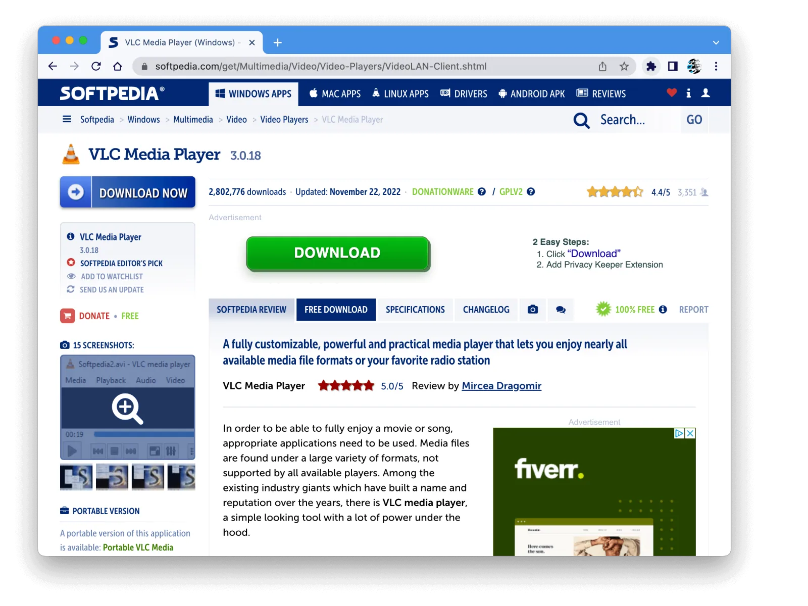
Goal. Download VLC, the program named at the top of the page.
Analysis. A large green DOWNLOAD control appears inside an advertisement for another product. Its generic wording competes with the blue software-download control, so clicking the most noticeable button may lead away from the intended download.
Redesign. Make the destination clear before the click.
Proposed redesign · schematic
VLC media player
ADVERTISEMENT · DIFFERENT PRODUCT
Privacy Keeper browser extension
Learn about this extension →Name the downloaded product and platform. Separate advertising visually, use an obvious ad label, and avoid a second ambiguous Download button. The intended result is fewer mistaken clicks, not simply a different button colour.
Case 6 / 6
Obstruction: accepting is easier than refusing
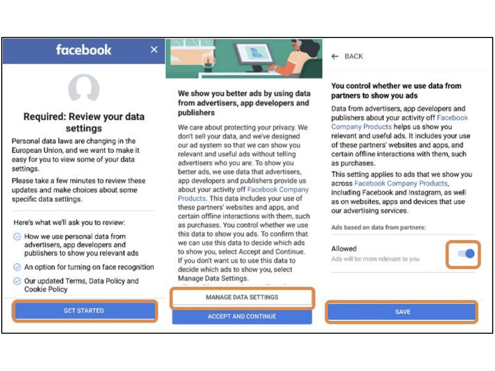
Goal. Continue using the service while deciding whether partner data may be used for advertising.
Analysis. Accept and Continue offers an immediate route. Refusing requires entering Manage Data Settings, changing a toggle and saving. The extra effort makes one choice easier to finish than the other.
Redesign. Support an informed decision with comparable effort for acceptance and refusal.
Proposed redesign · schematic
Present both choices at the same level, with equal visual weight and one clear action each. After either choice, confirm the saved setting and explain how to change it later.
HW1.pdf / Page 2
Lab Homework 1
The two practical tasks belong to the same handout but have separate process journals:
Lab 1A · Set up a blog · 5 points →Lab 1B · Set up Unity · 10 points →
The lab instructions ask for the approach, problems, solutions and useful advice—not just final results or code.
Before submitting this draft
- Review the published website at icey000.github.io.
- Complete the personal daily-life evidence for Parts 1 and 2. Keep source credits for any retained reference images.
- Check that each explanation matches what the image or video actually shows.
- Complete both lab journals after performing the work. Do not convert planned steps into invented past experiences.
Assignment structure checked against HW1.pdf, pages 1–2. Original redesign schematics and draft explanations were prepared with AI assistance. No user testing is claimed.