
HCI
HW3 · Everyday abilities, augmented
Prototype draft · participant test pendingDraft for review. The latest instructor email explicitly assigns HW1 and HW2. This draft prepares the later assignment in HW3.pdf; it does not imply HW3 is currently due. The sketches and prototype were prepared with AI assistance from my chosen concepts. No participant evaluation has taken place.
Assignment and approach
HW3.pdf asks for at least three ideas with sketches (Lecture 7, 5 points), a prototype suitable for a first user exposure (Lecture 8, 5 points), and evaluation with at least one person other than myself (Lecture 9, 5 points). Its theme is enhancing human abilities with augmented reality.
I explore three everyday difficulties: understanding French in context, finding the correct entrance at an unfamiliar address, and learning to operate an unfamiliar device. Each concept adds guidance to the relevant part of the physical world.
Lecture 7 · Three ideas
1. French in context
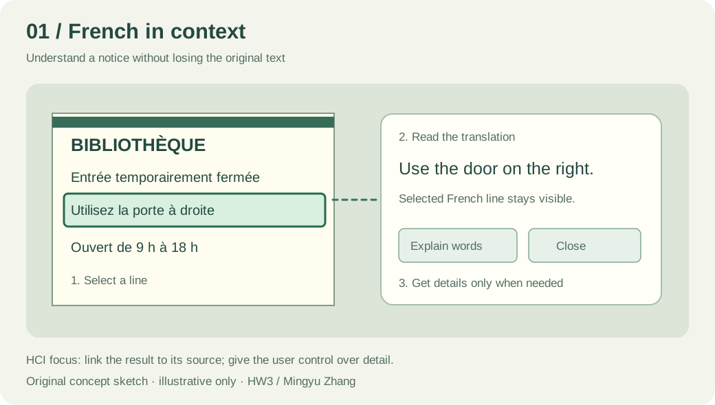
Goal. Help a learner understand French notices, signs, labels and instructions without repeatedly switching between the object and a separate translation app. The scope extends beyond restaurant menus.
Interaction. Point at a notice, select the relevant line, and read a short translation beside it. Open a word explanation when needed. Close the translation to return to the original scene.
Analysis. A selection outline connects the explanation to its source. Keeping the original text allows comparison and supports learning. Revealing details on request reduces clutter. A recognition failure should ask for a clearer view instead of presenting a confident guess.
Limit. Translation may miss context, and an overlay may cover useful information. Initial evaluation should ask whether people can find the relevant line and verify its meaning.
2. Address and entrance guidance
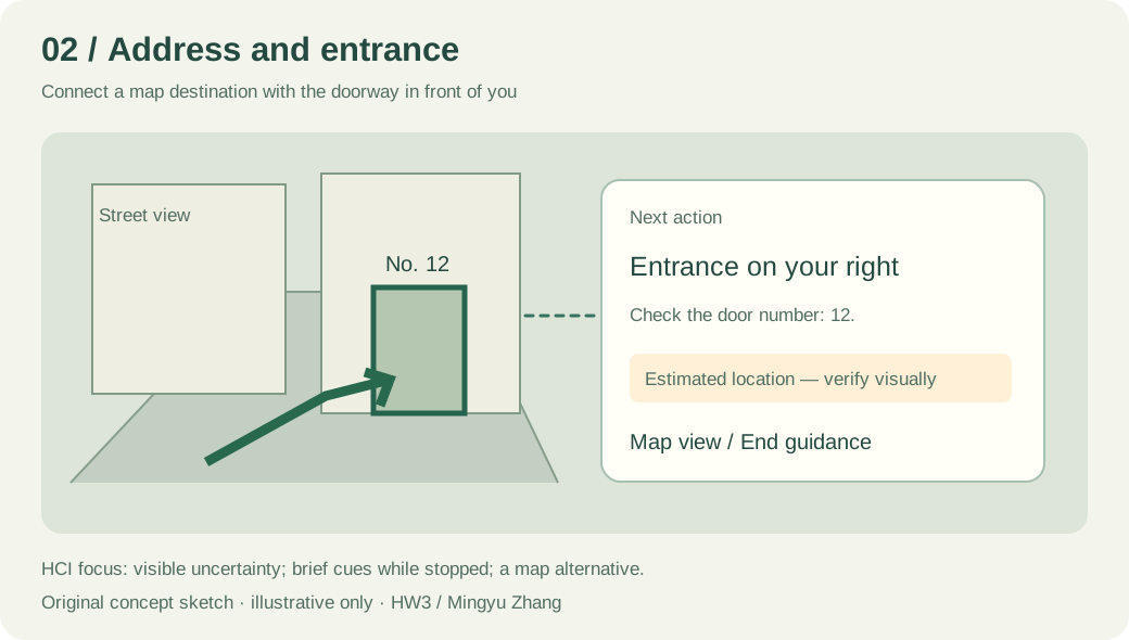
Goal. Help a pedestrian connect an address on a map with the actual street and building entrance.
Interaction. Enter an address, briefly raise the phone while stopped, and compare a directional marker with the real street. Near the destination, highlight the intended entrance. A map and text directions remain available.
Analysis. An arrow can make a turn easier to interpret, but the display must distinguish an estimated position from a confirmed entrance. Short instructions such as “Entrance on your right” are clearer than a screen full of route markers. Guidance should recede after the user has oriented themselves.
Limit. Incorrect alignment could point to the wrong doorway. Location uncertainty must be visible. A prototype would test interpretation of the cue, not actual GPS accuracy or safety while walking.
3. Operation learning assistant
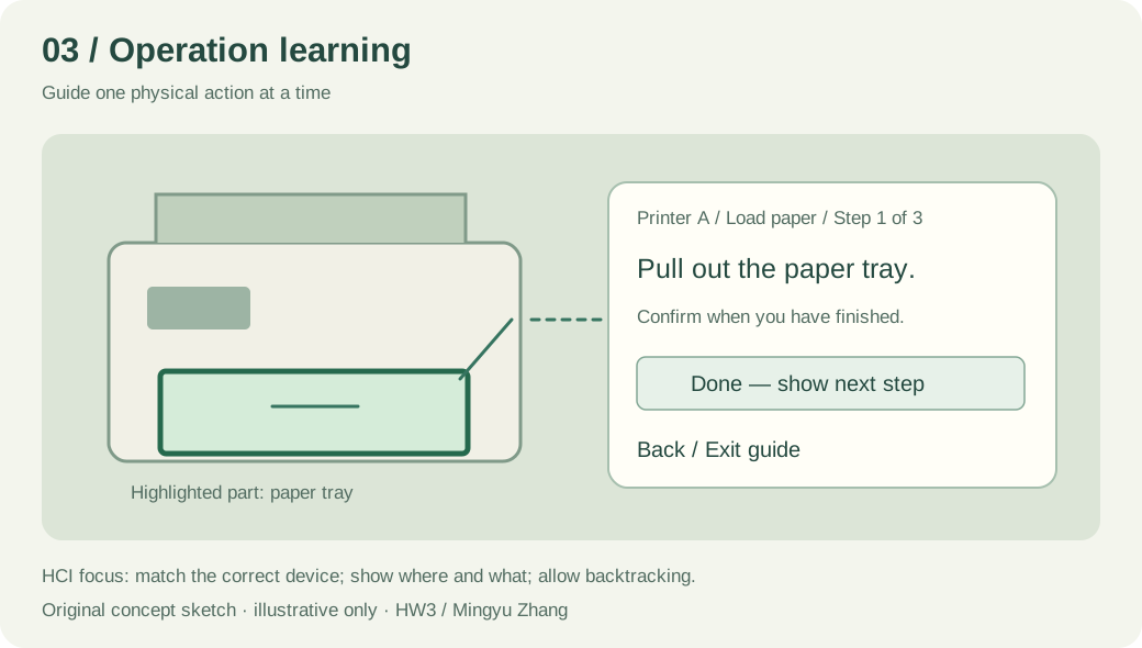
Goal. Help a first-time user perform a physical task, such as loading paper into an unfamiliar printer.
Interaction. Choose the device and task. The system highlights one part and presents one short action at a time. The user confirms completion, can revisit a step, or exits the guide.
Analysis. The highlighted tray answers “where?”, while a short sentence answers “what should I do?”. Explicit confirmation avoids advancing merely because the user looked at the part. Back and Exit give control when the guide does not match the situation.
Limit. A guide for the wrong printer model could be misleading. Device identity must be checked before the sequence starts. The first prototype should use a simple task with a known device layout.
Lecture 8 · Prototype: French in context
I selected the French assistant because it gives the first test a concrete task: understand which library entrance to use. It also allows a recovery scenario without requiring live camera tracking.
Open the interactive prototype
The prototype contains an original illustrated notice and predefined English translations. Buttons simulate pointing at text. It has no camera access, OCR, live translation, spatial tracking or data upload. The illustration is a fictional scenario, not a photograph of a real university notice.
What the participant can do
- Select a French line from the notice.
- Read its translation and compare it with the highlighted original.
- Request a short word explanation.
- Close the translation without losing the original scene.
- Try an unclear-text scenario, then choose a clearer view or return to the original.
Design decisions
Discoverability. “Select a line to translate” explains the first action. Text choices look interactive and support keyboard activation.
Mapping. The translation card repeats the selected source sentence. Both its location and label connect the result to the original.
Feedback. A selected line receives an outline, and the result area announces the change. An unclear view produces a specific recovery message.
User control. Close, another line, and Reset allow exploration without a permanent change. A participant can inspect the source before accepting the explanation.
Attention. Only one translation appears at a time. Vocabulary information is optional. The design hypothesis is that this is easier to follow than translating every visible line at once.
What this prototype can tell us
It can reveal whether the labels, selection and recovery steps make sense. It cannot establish recognition accuracy, physical comfort in AR, tracking stability, real-world readability or long-term language learning. A later prototype on a device would be needed for those questions.
Lecture 9 · Evaluation plan
Status: not conducted. At least one other person must interact with the prototype. A working webpage and an AI review do not replace that requirement.
Participant and procedure
Recruit one person other than myself, explain that the interface is a simulation, and record their familiarity with French and translation apps. Use a participant label such as P1 rather than publishing their name. Ask them to think aloud and explain that the interface, not their ability, is being tested.
Give tasks without naming the buttons they should press:
- “You have reached this library. Find which entrance you should use.”
- “Find out when the library opens.”
- “Check a word you do not understand, then return to the original notice.”
- Switch to the unclear-text scenario: “The text cannot be read clearly. Show what you would do next.”
Observe the first action, pauses, wrong selections, requests for help and whether the answer is understood. If I provide help, record it rather than counting the task as independently completed. Afterwards, ask what the person expected, which parts were confusing, and whether an ordinary translation screen would have been sufficient.
Record and revise
Download the blank observation sheet
For each task, record: actual action; completed independently / completed with help / not completed; observed difficulty; participant comment. Then connect each proposed revision to an observation. One participant can reveal a problem, but cannot demonstrate that the design works for everyone.
Results: pending a real session.
Changes based on participant feedback: pending that session.
Preliminary critique, before testing
The notice has only three selectable lines, so it may be easier than a busy real scene. Clicking a sentence is also more precise than pointing a camera at one. The English interface assumes the participant can read English. These are limitations of the current test, not participant findings. Later versions could compare an adjacent translation card with an overlay placed directly over the text.
References and provenance
- Course brief: HW3.pdf, Lectures 7–9, “Enhancing human abilities in the age of augmented reality.”
- Google Translate camera help: reference for selecting text within camera translation.
- Google Maps Lens help: reference for relating walking directions to a camera view.
- Microsoft Guides design guidance: reference for short instructions attached to a physical task, not a required tool for this assignment.
The three diagrams are original concept illustrations, not screenshots of functioning AR products. Claims about the proposed design remain hypotheses until tested.